On the 27th – 29th November there were 3 film screenings by LUX Prize at St. James Cavalier in Valletta. Three brilliant films which made the screening that much more enjoyable. My favourite, however, has to be The Broken Circle Breakdown. It has an entirely non-linear narrative structure, which shows the story of two lovers in the most original manner. The dialogue was used to a minimum and the story was shown clearly through the visuals (which is how films are supposed to be). There was no single scene that was extra in any way; we were given only the necessary information to understand the story, through the use of a fractured sequence that links everything together.
The film also uses foreshadowing and pathetic fallacy as tools to develop the narrative.
Miele; The Broken Circle Breakdown; The Selfish Giant
This is a short film about a woman in a controlling relationship, who finds comfort in her artistic expression. I do think that the type of lighting and colour (the cold blue and white) helped set the mood that the film needed. It did not have vivid colours or dark ones, those light colours gave it a sense of expression. The cutaway of the first butterfly was also complimenting to the story, and the use of fast motion gave it character making it stand out from any regular butterfly being filmed. In the introduction we see the woman in a field on a swing and the sky is overexposed, however this helped me understand that she was in her own imaginative world, in which she finds solace.
Dialogue was not overused; what was said was needed for understanding the story. Otherwise, the shots used explained the characters quite effectively.
I have three ideas for my scriptwriting unit. They are all quite raw. However, I decided to brainstorm for a different idea by using my favourite technique free-writing. This is what I came up with. Simple and short, but it could work as a short film.
Next Friday we need to present our idea. However, we have not yet had any lectures regarding this task, so I’m not exactly sure what is required of us.
I free write on a regular basis, and after I revise some of them they end up on my personal blog, from which I reblogged this.
A beautiful sky; clear and starry. Trees all around praising the stars as a breeze moves gently through their hands. A man screams at the sky. He wants to silence the stars. They scream in his deaf ears; the only screams he can hear. Leave me alone, he shouts. I need my peace, he says crouching onto the damp grass as tears get lost in his beard. The stars keep shining. The screams all fade as the man shuts his eyes.
The following is an interesting short film. It is about distraction and the unconditional love that animals can give us.
The story is narrated with the use of subtitles. Personally, I think it is an effective way of telling the story without the usual voice over.
As part of our assignments we are required to write a script and produce a short film. Since it would be a student film a budget is near to non-existent. This short shows that a story can be told by the simplest of means, and that is what I am looking for while brainstorming short film ideas.
Today was the presentation deadline for our television advertising unit. We were required to present and analyse three adverts from the past to current. My chosen adverts were from the Oreo brand.
The first advert was from 1993 with the slogan “Unlock the Magic”. It has a linear structure, is a realist advert because it has nothing out of the ordinary, and is closed ended since there is nothing more which the audience needs to know after the advert. The advert shows how the product should be used and that was their Unique Selling Point (USP).
The second advert was from 1999, this time with a different slogan, “Only Oreo”. This also has a linear and realist structure with a close ending. The USP is the plot in which you have the younger kid who tries to copy the other by dunking his Oreo, but has a problem which he manages to overcome. When he does at the end, the kids reaction creates an emotional response with the audience were they may relate.
The third advert is from Oreos recent campaign. It has a linear structure with anti-realist elements since they use fantastical characters. It has an open ending because the anthem finishes with a question “What if I gave an Oreo to you?” and in that way it is up to the individual to decide what comes next. It uses celebrity endorsement as the song is performed by Owl City, and also there are various versions performed by different artists online. It is an upbeat and adult-oriented advert. Mostly because the adverts first television debut was during the Tv show ‘Mad Men’, which has a very loyal viewership and is also very social.
The use of repetition of the phrase, “What if I gave an Oreo to…” is the brand identity, as well as the repetition in the animation where we see two character hands sharing an Oreo.
That pretty much summarises my presentation. I do think it went well, although I could have mentioned a few other things which were included in my presentation notes.
As part of the first task of our Documentary unit we are required to choose two documentaries of different genres. These will be analysed and presented in the form of a presentation. The following are the two trailers:
The first is an investigative documentary that uses the fly-in-the-soup technique.
The second is an investigatory and biographical documentary about the secrets of a family of storytellers.
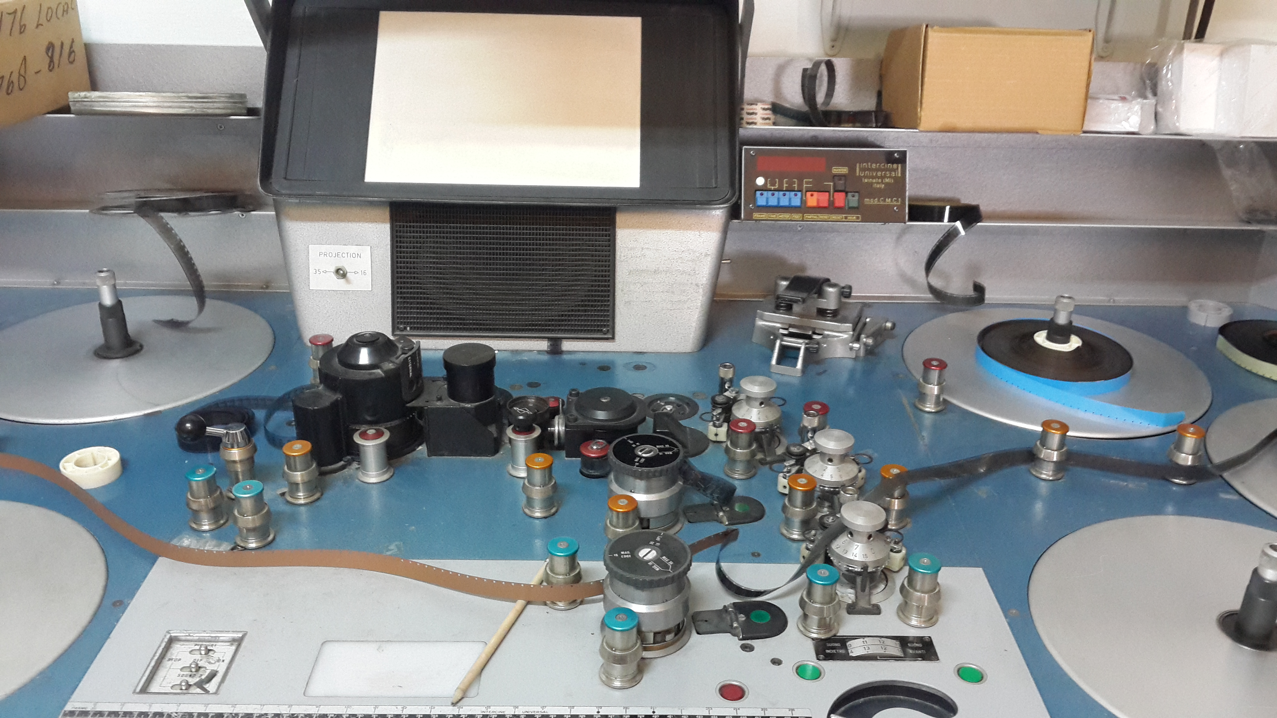
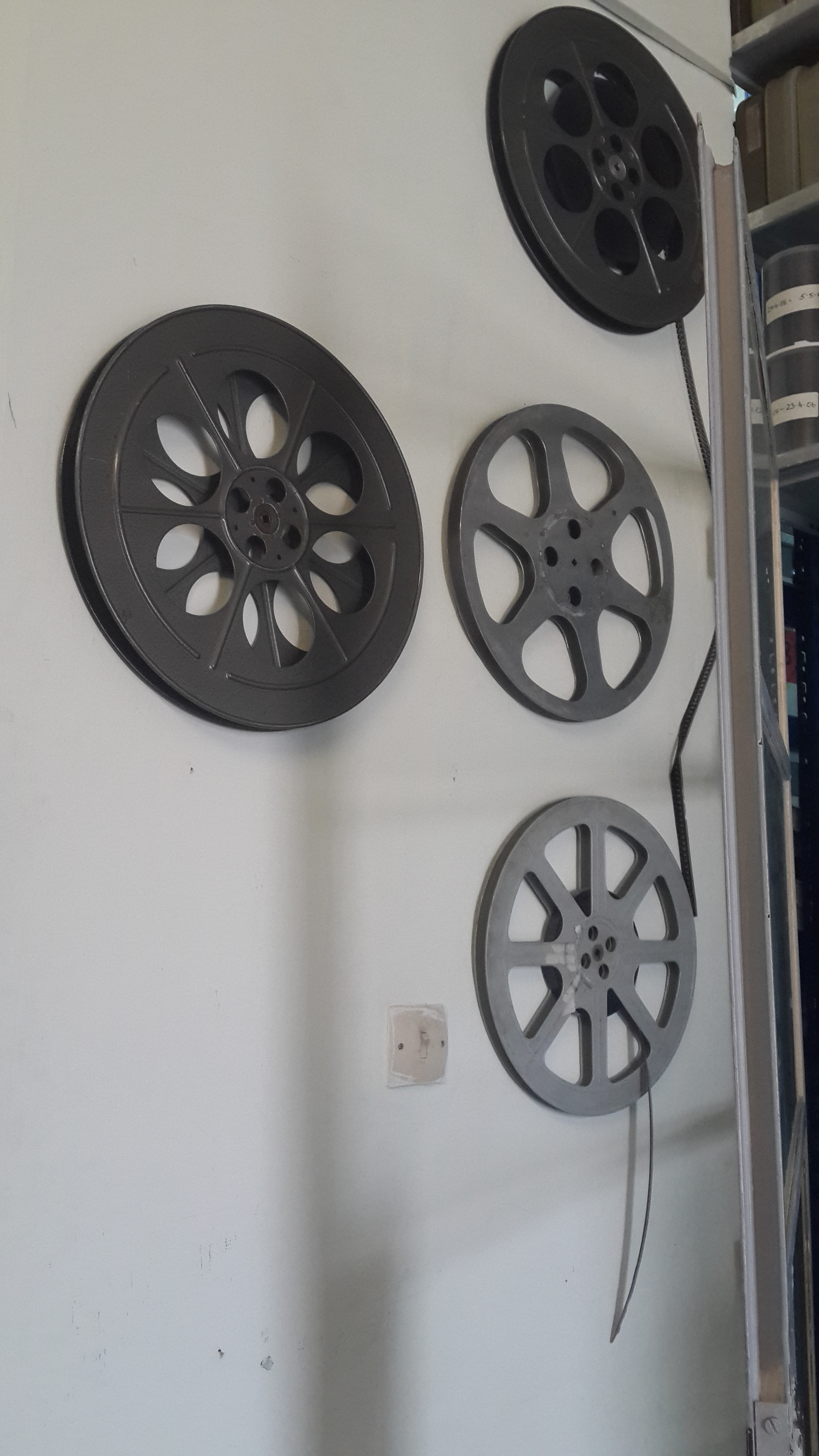
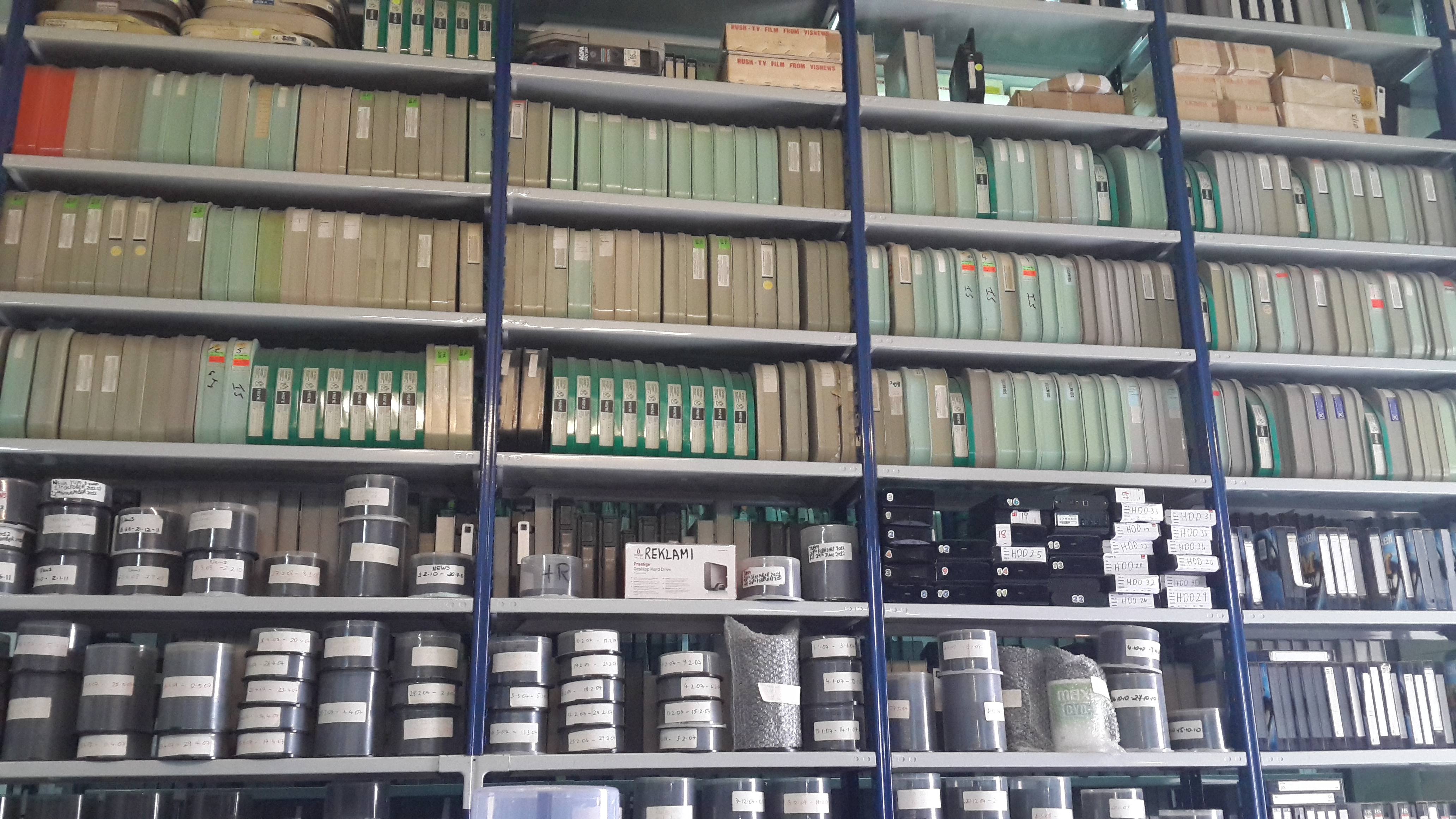
As part of our lecture today we visited the National Television station (TVM) and the Broadcasting Authority. The following are some photographs from the archive storage of old and recent Television productions.
I feel that from this event we could understand better the lectures, especially during the Broadcasting Authority discussion.
Quite an extensive storage of archive beta tapes
The machines to view the negatives on reel.
These are some old reels decorated the archive storage place.
These are some of the archive beta tapes and the more recent ones on CD’s
As a person who indulges in certain TV show fandoms, I found the following short documentary quite interesting.
In about 7 minutes it discussed:
how people always seemed to collaborate in creating a kind of fandom in the past,
how it is changing what is considered as gender norms,
how news can create a type of fandom while building up a bigger hype,
and how fan fiction is driving copyright evolution
This was from the same source as the other documentaries I posted about last week. For this reason it more or less had the same structure. Yet, giving it the identity it deserves by the use of colourful typography similar to those seen in memes.